Alexander Vasin, graphic designer
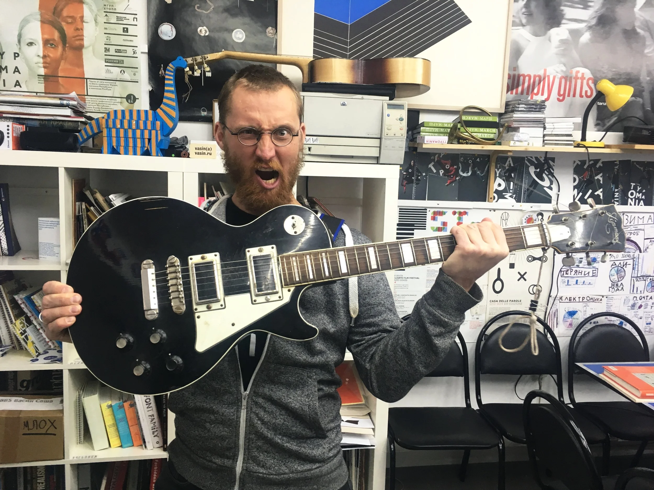
Some people give you energy. In Moscow, you will find that the city is exhilarating with its lights, architecture, and never-ending activity. But first contact with people are often less positive because smiling is not a common practise among strangers. I keep smiling even though I know I might be considered as retarded! Alexander Vasin was like a vitamin pill in a grey afternoon. No wonder he named his design studio гроза, which means thunder, storm. He and his friend Sacha welcomed me into his studio, hidden on the floors of the Institute of Business and Design. A studio as studios should be: full of “stuff”, posters, weird objects and works in progress by his students.


Alexander Vasin is graphic designer and teacher. He manages a design studio specialised in culture, festivals and a lot of various projects.
As he says :
“I like to do different things very much.
I am a free man.
I can do anything I want.
I can choose my sphere of work. I can say no to clients I don’t like.
And also I like to bike.”
Seven years ago, Alexander applied to a designer competition. He sent his proposal one day late and they did not accept it so he thought “If I would organize this kind of competition, I would give some extra time”.
That, and the fact that he wanted to meet his favorite famous designers led him to invent the Typomania Festival. For the past six years, the festival allows him to not only get acquainted with other graphic designers, but also to create a friendly and informal atmosphere where young and older designers from all over the world can chat and exchange ideas.
His love for mixing and sharing might also be the origin of his educational approach. Together with his wife Natalia they opened a private school and manage Typomania courses with other curators. Whereas some sessions last for an intensive 3 months, they also offer design lessons for kids at the Museum of Moscow, technical classes and some design camps abroad.
A lot to do for someone who wanted to be a rock musician !
Still, this load of activity create a virtuous circle :
First, the studio and the courses are commercial, which allows Alexander to dedicate some time to pro-bono graphic projects as well as to the festival. Still, as often, the festival is energy-consuming and Alexander begins working on the next edition a week after the end of the previous one. This energy, along with the help of committed volunteers, is the festival’s driving force and the only way to mobilize partners: the Museum of Moscow offers a big discount, cultural centers and embassies usually support with tickets and visas for foreign guests, and at every stage of the event, somebody is there to help.
Also, this perpetual movement fuels Alexander’s inspiration. No need to look out for it, inspiration is everywhere, especially when working with kids.
This workflow is made possible by Alexander’s ability to work fast.
His rule “I never search for clients, they come to me” saves some time on prospection. Then, after a thorough conversation in order to have a clear brief, he can have the work done in an evening. Having it all in his mind makes the computer execution fast, when Alexander does not just explain his vision to his team on the phone.
The result is always beyond what the client was expecting. Innovation is key in Alexander motivation:
“Innovation is what interests me. It is a way to answer the customer’s expectations. I usually propose something new that they did not want in the first place, and they change their minds when seeing it. It is important that the customer takes the step with me and that we become better together. Graphic design is mainly about solving a problem.”


One of the problem he avoids is dealing with official guidelines.
Graphic design and especially typography have a special and tragic story in the heart of the capital H History in Russia. The natural way of development of typography has usually been impacted by the will and the need of leaders.
For instance, Peter the Great first simplified the alphabet and the shape of the letter were modified. Then, considering them too imperial, the USSR kept destroying types to replace them with “more Soviet” shapes. Alexander describes contemporary times a “renaissance” era : “We can name all things, establish new rules for typography”. Again, freedom allows him to express himself and play with the letters.
To protect his freedom, he created a small size “playground”. Among big institutions and pyramidal structures, he promotes small organizations.
“Interesting stuff can only appear in small institutions, small schools, where people can create something strange or interesting. I was lucky to establish my own studio and my own private little school. Small is better than big, there is more freedom, but this is anarchy.”
Anarchy I would like to compare to Moscow graphic identity for a newcomer: very modern and even minimalist on one hand, very kitsch on the other. As often, disorder is a creative opportunity: “Before, I regretted that Moscow does not look like Zurich where design is everywhere. Now I know that it is great because this is a timeliness to change something. Kitsch helps me to make something new in contrast. It is funny to live in this eclectic Moscow.”
Fun would be the final world because when asked about his feeling of responsibility toward society, here is what Alexander answered:
“On one hand, I want to answer that I do have a responsibility. I want to believe that the ideas we give to our students will somehow help create a graphic culture in the country. But on the other hand, I do what I want and because I like it. If it happens to be useful for someone, then it is great. But I am no superhero, I am not on a mission”.
The Typomania Festival :
The 6th edition of Typomania Festival will take place from May 26th to June 3rd 2018 at the Museum of Moscow.
This year, the festival will welcome guests from more than 20 countries, gathered to explore the theme West/East: 2 days of the program will be dedicated to West (France, Germany, Switzerland speakers…) and 2 days to East (Indian, Lebanese, Chinese, Japanese graphic designers). It will talk not only about typography and graphic design but also about non verbal communication, visual content and language, and means we use to communicate besides typography.


